
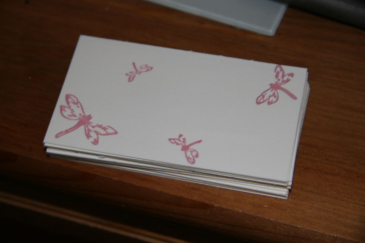
Anyhow, like the Beth Cohen Riding business cards, the Joie Studio design is a 2 color concept, with the four Joie dragonflies in the back in a light pink and the text in front in a deep red color. I also printed this on Crane's 179lb cover in pearl white.
Step 1: Pink
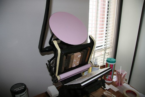
This design is a lot easier than Beth's since the second color will lay on top of the first color -- no need for exact registration as in Beth's design.
Here are the dragonflies:
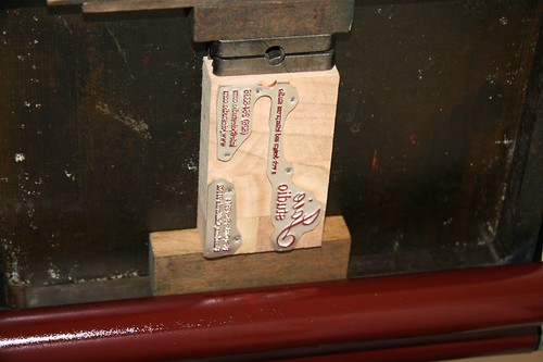
Step 2: Red
After the pink had dried, I mixed PMS 201 (I had originally mixed PMS 199, but I decided it was too "Corvette" red, and I wanted a deeper, more burgundy tone) and started on the second color. Here is my plate, inked up with red:
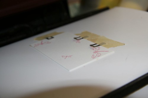
Here is a card with the first color on, on the press for the second color:
FINAL PRODUCT
Here is the final product! Now, to get started on setting up the email address before anyone tries to email Joie Studio!

3 comments:
i see the clips with tape keeping your paper aligned. what are these things, and where can i buy some? (i'm just using tape, and hoping it won't pull fibers from the paper)
thanks
Hi Kristin,
Those are registration guides, which you can find here: http://www.dickblick.com/zz380/00/
Thanks for reading!
Tina
thanks so much, tina. GREAT work on here.
Post a Comment