Wednesday, June 27, 2007
A card for Beth...
Wedding Invitations Done!
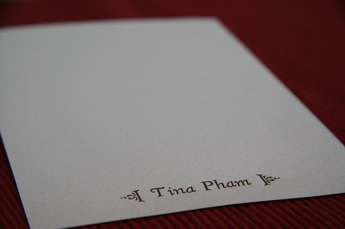
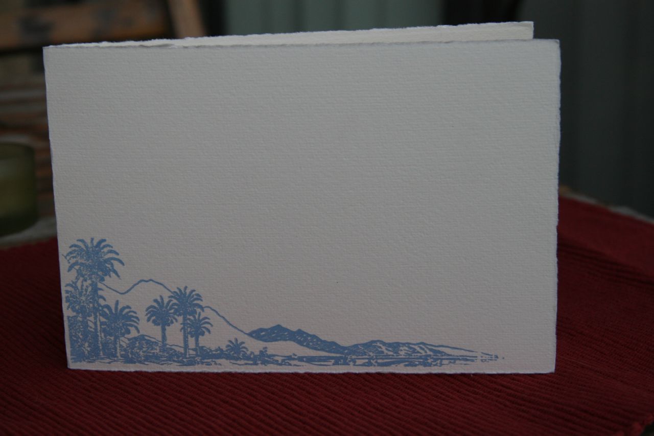
And here is a sneak preview of what the final invitation looks like. I will put the whole invitation set up for your perusal in a bit. The images I have are pre-assembly. The bride bought the enclosures for the invitations and will be assembling them herself.
I learned a lot throughout this whole process. I have pictures that I took while I was making these lovely invites, and I'll be posting those shortly as well. Enjoy!
Wednesday, June 13, 2007
More Linoleum Cuts!
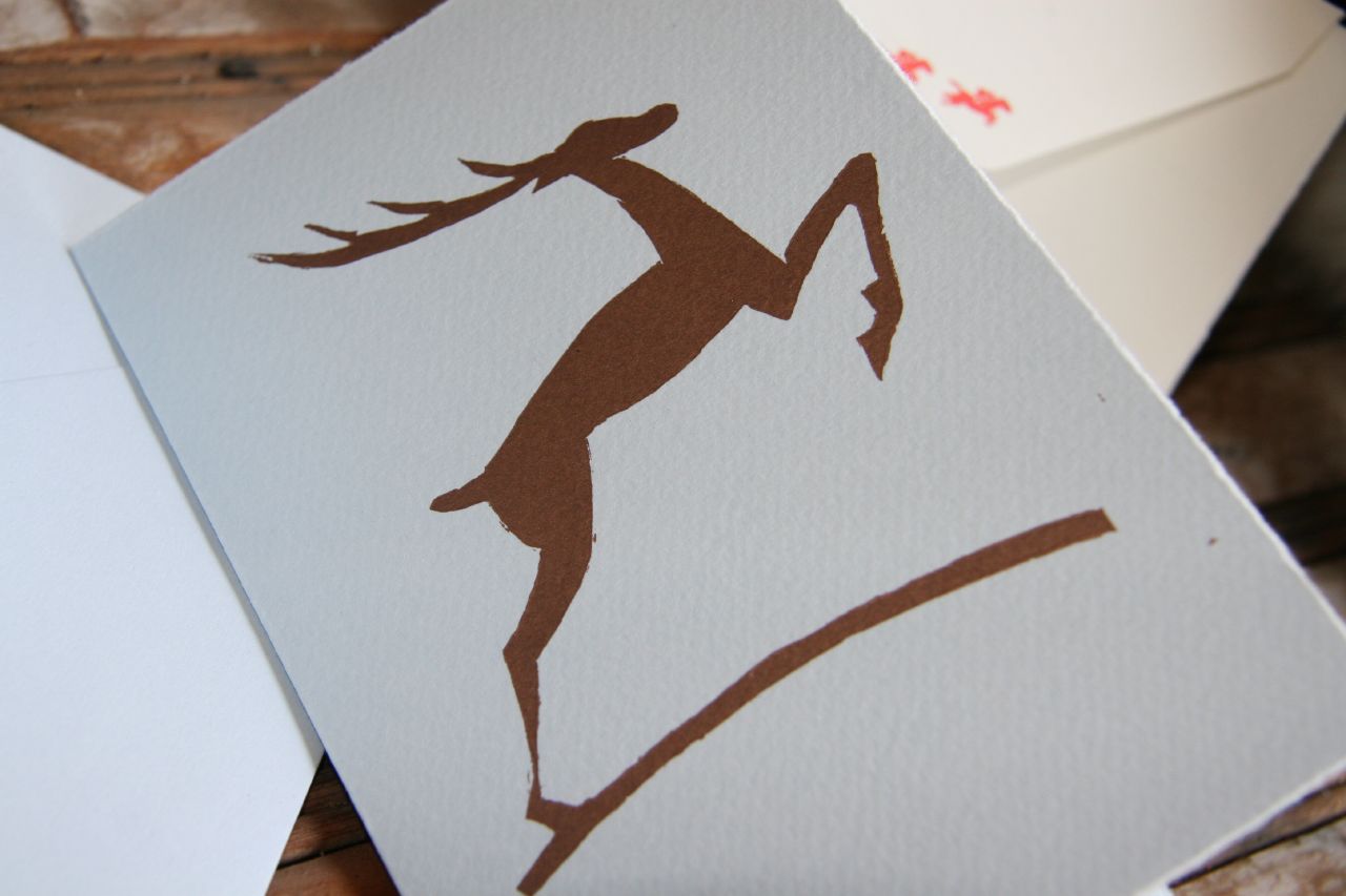
DEER

This is meant to be a holiday card. Originally the image had stars on it, which I tried to keep on the linoleum bloc, but clumsiness marred two of the stars, so I think if I put stars on later, I will do it with some dingbats. I had wanted to do a silver or gold originally, but since in class we have to share the machine, we agreed on a metallic copper color (PMS 8560). It came out beautifully on the light blue card, and the color was gorgeous on my friend Carrie's blush colored card as well (she had a linoleum cut of a french bulldog sillhouette). I made a matching envelope for this that I haven't had a chance to photograph yet.
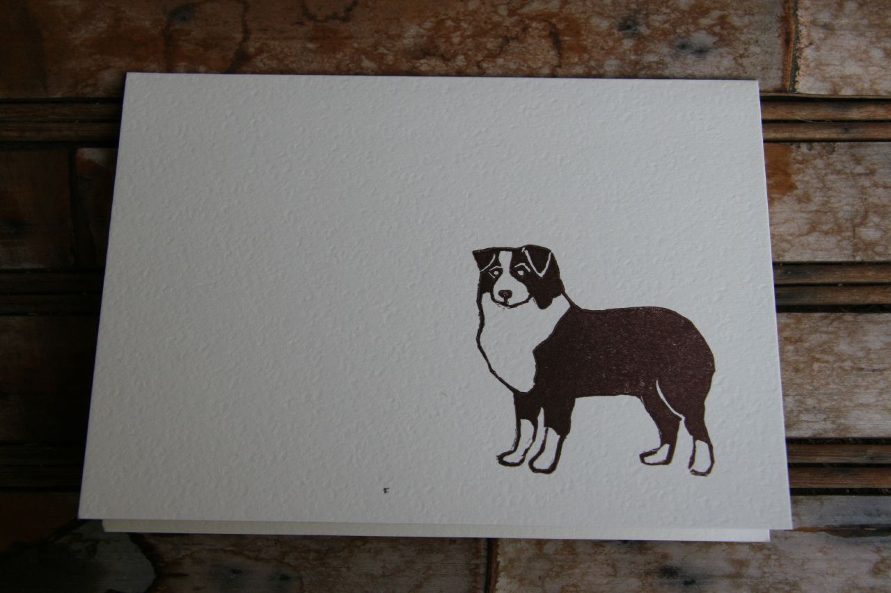
AUSTRALIAN SHEPHERD
Romeo was jealous of the fact that I made a card with Jezebel on it, I carved an image of an Australian shepherd and printed it. I had wanted to do it in a blue or grey color to match Romeo, but brown was the color of the day on the Vandercook, so brown it was! The fine lines on this came out really well, and I'm very pleased with how it looks. I use a number of different Exacto blades for the fine lines, but I know some people just use the regular carving tools and they come out just dandy.
I am going to attempt to print linoleum blocks on my Golding in the near future, in between these wedding projects. I've gotten pieces of advice on how to do this. I'll let you know how it turns out!
Wednesday, June 6, 2007
Cleaning Up Ink on the Cat...
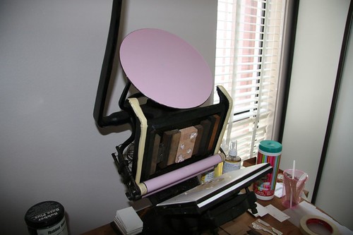
My cleaning setup is as toxic-low as I can make it. I use canola oil to clean ink off of the press and equipment, and I follow up with just a bit of California Wash to take off the oil residue. Every now and then I use Putz Pomade to condition my rubber rollers and I always use the California Wash on the plates, but other than that, it's mostly just cooking oil. Honestly, I mostly use the California Wash on my hands to get off ink blotches that don't easily come off with soap or oil.
But how do you get rubber based ink off of a cat? That is NOT something that is generally covered by letterpress discussion lists, blogs, or in class, and I wasn't about to use California Wash or mineral spirits on the cat. Neither is "how to get rubber-based ink off our pet's fur" a general resource on any vet website. One option that I offered up immediately was to shave her, but that didn't sit well with my husband. So here's the what we did to clean off our poor cat:
At first, we thought the only part of dear Jezebel that got inked was her front paw, so we doused it with canola oil and rubbed it in good. Then we followed it up with some good old fashioned Dawn dishwashing soap (I figured, if it is good enough to clean crude oil off of wild animals, it's good enough to take off diluted rubber based ink and canola oil off of my cat). While we were rubbing the Dawn in, Joel asked where all the ink stains on my pants were coming from. Jezebel then got a thorough rubdown while we looked for the source. Now, she's a black cat and I was using dark purple ink, so it wasn't very apparent where exactly the ink was. We figured out that it was somewhere on her tail and the rubbing in of canola oil and then Dawn continued on poor Jezebel's tail. After we finished with the oil and Dawn, Jezebel got dunked into a bathroom sink filled with warm water. We did this twice, and the purple ink with this treatment came right off once we figured out where exactly it was. Jezebel got her first bath ever. She's well and feisty, and she won't let us anywhere near her scraggly tail to brush it out.
Wednesday, May 23, 2007
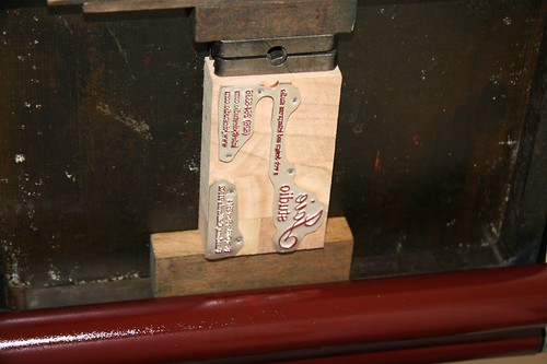
Joie Studio Business Card
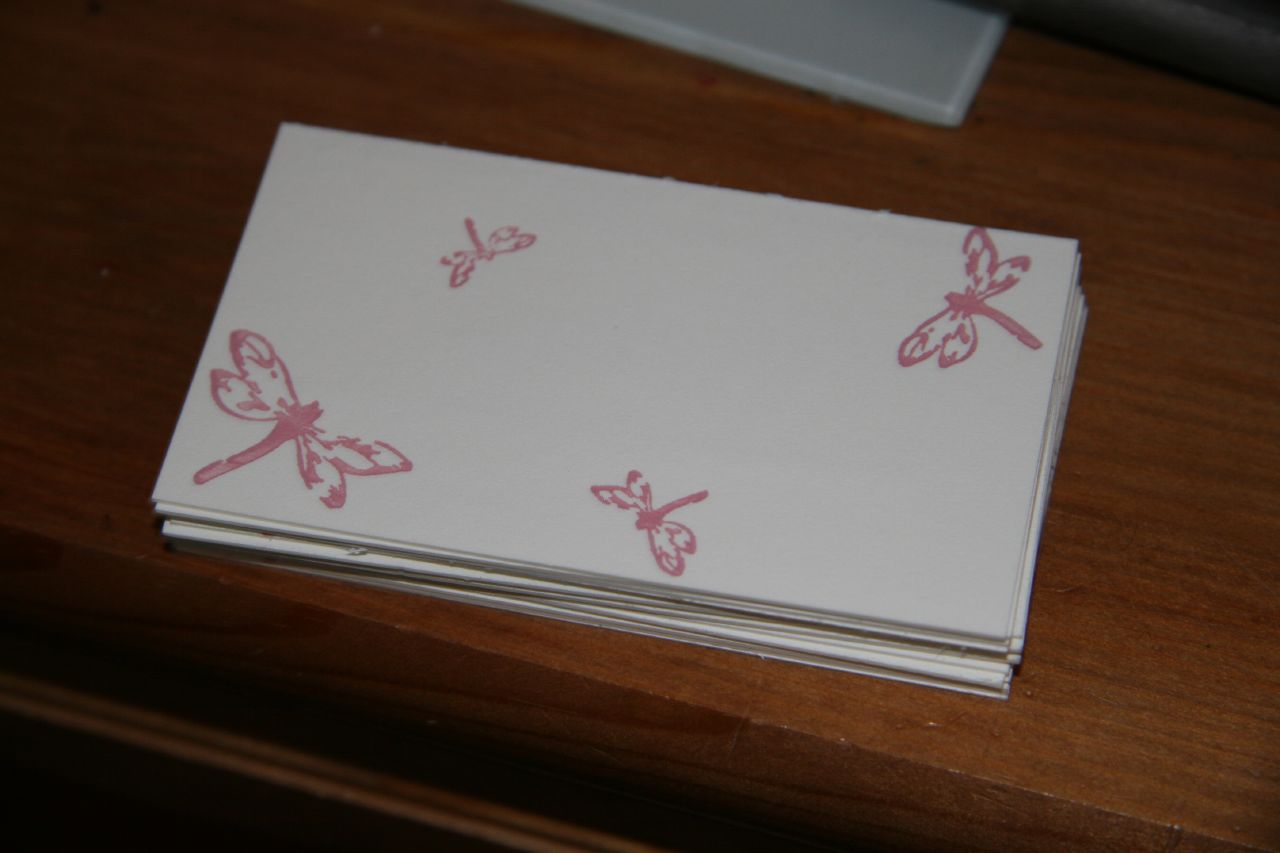
Anyhow, like the Beth Cohen Riding business cards, the Joie Studio design is a 2 color concept, with the four Joie dragonflies in the back in a light pink and the text in front in a deep red color. I also printed this on Crane's 179lb cover in pearl white.
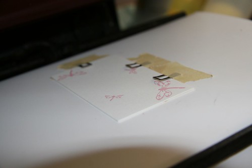
Step 1: Pink

This design is a lot easier than Beth's since the second color will lay on top of the first color -- no need for exact registration as in Beth's design.
Here are the dragonflies:

Step 2: Red
After the pink had dried, I mixed PMS 201 (I had originally mixed PMS 199, but I decided it was too "Corvette" red, and I wanted a deeper, more burgundy tone) and started on the second color. Here is my plate, inked up with red:

Here is a card with the first color on, on the press for the second color:

FINAL PRODUCT
Here is the final product! Now, to get started on setting up the email address before anyone tries to email Joie Studio!
Beth Cohen Riding Business Card

To do this, I had two plates made, one for the blue (PMS 306) and one for the brown (PMS 4705). I decided on Crane's 179lb cover in pearl white for the business cards. I custom mixed the colors and set out to print.
Step 1: Blue
Generally you want to print from light to dark, so I started out with the blue. The hardest part is getting the alignment right and avoiding having the gauge pins smashed by the plate. Here is the first color on the card:
Step 2: Brown
After the first color had dried (with rubber based ink, about 2 days in sunny southern California), I started up the press with brown. Generally, you don't want to print the second color while the first color is still wet (the term for this, I believe, is "wet on wet") because there's a chance that the colors will mix and mess up your whole print job. Especially with this color combination. Again, the hardest part of the brown step was the alignment and setting the gauge pins correctly.
FINAL PRODUCT
And here is the final product!
Monday, May 14, 2007
Inks: Buying, Mixing, and Storing

After much thought, discussion, and research, I decided to go with rubber-based ink as the primary type of ink for my letterpress studio, mainly because it would take forever for me to finish a one-pound can and rubber-based ink is less likely to dry out in the can. I have stocked up on a bunch of Pantone bases and have armed myself with Pantone color guides to make custom mixes for client projects. I bought Van Son Rubber Base Plus in Rubine Red, Pantone Yellow, Process Blue, and Opaque White. I received a bunch of oil-based black as samples, so I will wait until I need more. (Of course, metallic colors only come in oil-based ink, so I got a can of metallic gold oil-based letterpress ink from Accent Ink as well.)
There was a great discussion on Briarpress on inks, and one posting had a great technique at measuring out the different colors for mixing. Jason used "dabs" to count out the different color parts. I used this technique in mixing the more complex custom mixes, although I do have to say that I did a fair amount of "eyeballing" as well.
I mixed the colors for three of my current projects, below. The first row is for a wedding invitation, the second is for a set of business cards for my client, and the third is for Joie Studio's business cards.
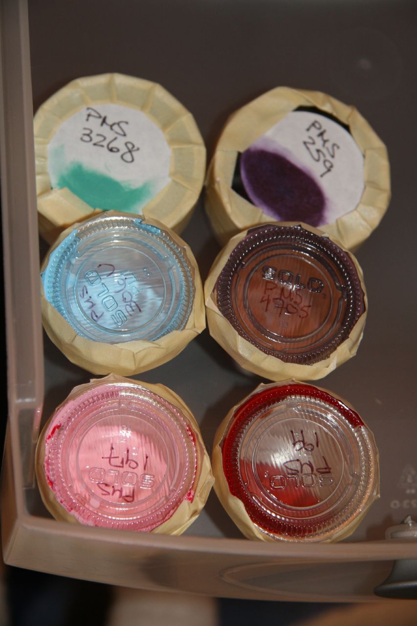
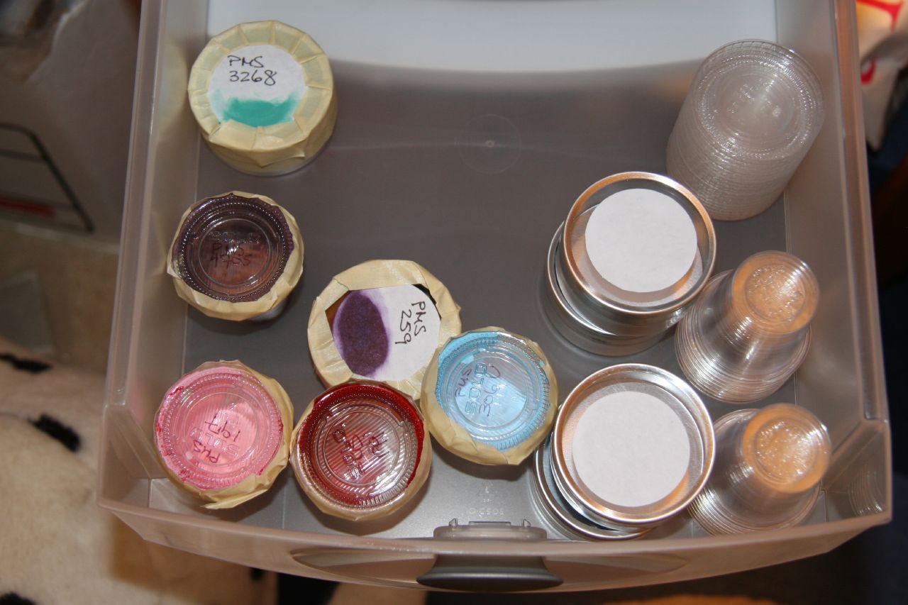
Finding containers to store the custom mixes has been an interesting scavenger hunt. Dave Celani talks about using 4 oz cans and 5 oz tubes to store ink, but the amount I'm making is significantly smaller than 4 or 5 ounces. At letterpress class, we use old film canisters, but as I've completely switched to a digital photography setup here, that doesn't quite work out. I did find at a local restaurant supply store and a local craft store (Michael's!) some good storage options. For small amounts of ink that I want to save, I bought those little plastic containers and caps that to-go places put sauces in (about $5 for over 100 containers). These hold, according to the bag, 1.25 oz. I use a thin-tipped Sharpie to write the Pantone color number on the lid. I also bought wedding favor tins from my local craft store (Michael's, though I've seen them everywhere, including Target in the wedding section), which hold about twice as much as those little plastic containers. The wedding favor tins (about $20 for 30) have a clear top and also come with labels. I used the labels to smear some of the ink on and to write the Pantone number on. I tape these containers up so as to keep air out as much as possible.
I am going to trade ink with a friend of mine who is also setting up a letterpress studio. We've bought some 4 oz cans and we luckily haven't had too much overlap yet on what colors we've bought because it would take either of us years to finish one of those cans of color!
Sunday, May 13, 2007
Step 3: Testing the Letterpress

After I got the equipment to lock up my chase, I put some sample black ink that I received on the Golding Official and set out to calibrate the impression. I also tested out how printing on coated stock would turn out. I used a snail cut I had made awhile ago and printed on A7 Stardream quartz card (pictured above). It made for a very cute "snail mail" card!

On my second test run, I used metallic gold oil-based ink I had bought from Accent Ink and printed the set type Dave Churchman had sent me (pictured above). It turned out beautifully! Thanks again, Dave!
I also printed out parts of some other projects with the metallic gold, which I'll show later when they are done!
Tuesday, May 8, 2007
We Can Live Beside the Ocean...

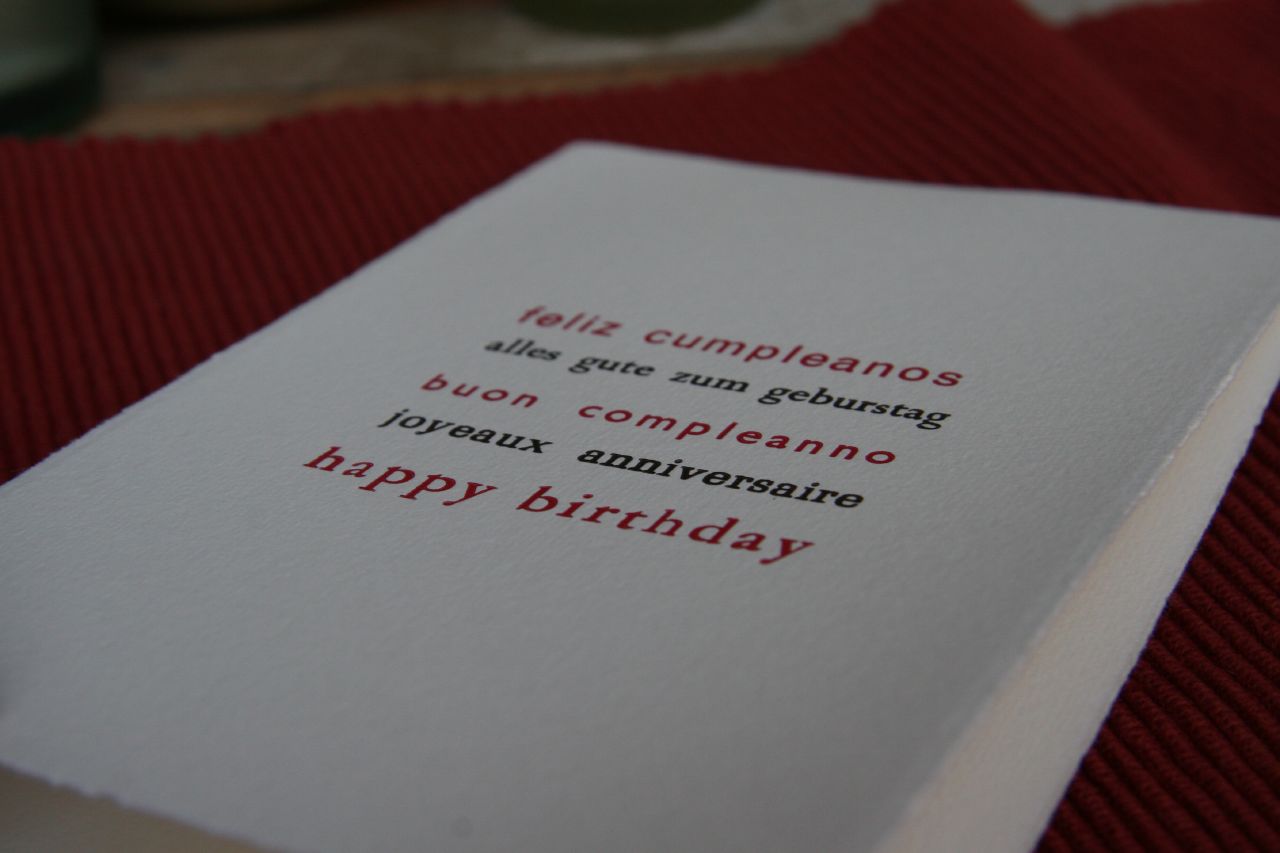
A Birthday Card!

As another exercise in typesetting, in addition to the "Many Thanks" card, I set a "Happy Birthday" multilingual card as well. I decided I wanted to alternate between a bright pink color and a chocolate brown. This is the first time I've tried such exacting registration between two colors, and I wish I had set it to alternately justify left and right instead of justified center that I did. I didn't have an accent for the "n" in the Spanish and there are some letterpress quirks in the typesetting, but I believe it came out beautifully. The Fabriano Medioevalis cardstock takes impression quite well (check out the bigger version of the pictures to see it).