Well, maybe the title of this post is a little misleading, because the letterpress business cards aren't yours, they are for YOUR LETTERPRESS at Joie Studio. I wanted to show these off because I am so so tickled as to how gorgeous the cards came out. These were printed on Joie Studio's newest house paper, Reich Savoy 118lb in bright white. The back of the card was flat printed with a gorgeous pattern and the front holds both letterpress and flat printing. The reason I did this was because I wanted the "Your Letterpress" signature to actually look like a signature -- you know, when you use a ball point pen and it presses down into the paper and leaves an impression after you've signed...kind of like what happens after the printing press presses the paper into the plate...
I think the results are absolutely fabulous! With "Your Letterpress" as the only thing letterpress printed, it really makes the "Your Letterpress" pop just a little bit more -- adding a textural element to the card. PLUS the card is for a letterpress studio!
The dual printing method on this card is quite awesome and I'm totally in love with the result. And the best part is that since it's flat printed, it costs less for me to do this double sided card than it would have to do the 2-color card just for the front (nevermind the front of the card is actually 3-color).
Showing posts with label Business Card. Show all posts
Saturday, July 17, 2010
Monday, June 14, 2010
Your Design...Your Letterpress
I remember quite vividly back in the day before Joie Studio when my friends and I were getting married that invitations were a big mess. It was hard. There were tears. I had ordered invitations within our budget, which wasn't very much, and it came on really crappy paper and there were oil splotches on some of them. And they were from a pretty major company, too. And all my friend wanted was an invitation with a burgundy backing and for whatever reason that wasn't possible. And then I ended up designing and printing my own rehearsal dinner invitations and it was exactly what I wanted and I thought, "Well, heck, I should have done this in the first place."
One of my goals for my wedding invitation clients is to make the experience as low stress as possible. To make it a fun and happy experience. And give people access to letterpress. Letterpress is beautiful, allowing printing on the most gorgeous art papers that won't normally take digital print methods. I know from looking through countless invitation books that sometimes you just can't find what you're looking for. And most brides and grooms today are savvy enough to design their own invitations or have a friend who can help them get it to print ready format.
I get asked a lot if I will print designs not my own. Yes. There are caveats, but yes. Then I ask if I can provide paper. Yes. Absolutely. You can't letterpress print without paper. Then I get asked if the invitations come with envelopes. Why, yes. Yes, they do. Unless you want special ones. But you get matching envelopes, yes. I can help you source envelopes (I also remember a trip to five different paper stores in the LA area looking for the right envelope) if you want a special color or type. And the pricing I give is pricing without the designing element, because you've already taken care of that. Based on your design, I can give you suggestions on how to save more.
This is how the idea of Your Letterpress was born. Letterpress printing in itself is both an art and a craft. We have these antique presses with peculiarities to them and we learn to compensate for our presses, temperature, humidity, paper type, ink type, etc., etc., etc. You can take care of the design, we will print with great care. And from experience, those interested in letterpress are interested in the process of it, the care that goes into the making of letterpress goods, the handmade artisan quality of the printing. So we've dedicated a camera and a videocamera to the studio so we can take pictures and video of the process for those interested.
If something like Your Letterpress was around when I got married, I would have done that because according to my pricing it was all of a dinner for 4 out at KFC more to have letterpress instead of what I received.
Check out Your Letterpress and contact us at YourLetterpress {at} JoieStudio.com with any questions.
Friday, June 11, 2010
Hello Fabulous!
Oh these gorgeous yellow boxes. Filled with gorgeous Italian paper with deckled edges. When I first started printing, Fabriano Medioevalis was what was recommended for us to use in class. It's safe to say that I learned how to letterpress on Fabriano Medioevalis. Now I print mainly on Lettra, which is also a wonderful paper but it is a very very different paper.
One of my favorite clients, and probably one of the most fabulous people I know, asked me to letterpress her business cards and stationery on Fabriano Medioevalis, and I was reminded of how fabulous Fabriano Medioevalis is. It was a little bit of a pain with the deckled edges (it made the paper stick together, the deckling made the paper not quite uniform the whole way through...I could go on), but the results are absolutely fabulous!
Laura has a blog chronicling how to be fabulous everyday, and I'm loving the tips and reviews she's blogged thus far. I have to say some of her posts have really gotten me to think about little things I can do to have a more fabulous life. Check out Laura's blog at www.fabulous365.com!
One of my favorite clients, and probably one of the most fabulous people I know, asked me to letterpress her business cards and stationery on Fabriano Medioevalis, and I was reminded of how fabulous Fabriano Medioevalis is. It was a little bit of a pain with the deckled edges (it made the paper stick together, the deckling made the paper not quite uniform the whole way through...I could go on), but the results are absolutely fabulous!
Laura has a blog chronicling how to be fabulous everyday, and I'm loving the tips and reviews she's blogged thus far. I have to say some of her posts have really gotten me to think about little things I can do to have a more fabulous life. Check out Laura's blog at www.fabulous365.com!
Friday, June 27, 2008
Dot dot dot...
Remember those letterpress business cards I alluded to?
I met Diana of Ellipses PR about a month ago at Bazaar Bizarre, and it's been a pretty fun ride ever since. She asked me if I could do some letterpress business stationery for her public relations firm. Our original concept was her logo on the card, paired with brown envelopes letterpress printed in metallics. Do you notice that the accent color is metallic mauve? I heart metallics on dark envelopes! Diana and I decided on the ellipses (you know, the multiple dot dot dots) border on the bottom:
Here's a closeup of the logo. I love the impression:
Diana also put in an order for letterpress business cards. Here they are, with rounded corners:
I also printed white envelopes for Diana's business stationery, in case she didn't want to use a metallic pen for the envelope. Here's the entire suite:
Enjoy!
I met Diana of Ellipses PR about a month ago at Bazaar Bizarre, and it's been a pretty fun ride ever since. She asked me if I could do some letterpress business stationery for her public relations firm. Our original concept was her logo on the card, paired with brown envelopes letterpress printed in metallics. Do you notice that the accent color is metallic mauve? I heart metallics on dark envelopes! Diana and I decided on the ellipses (you know, the multiple dot dot dots) border on the bottom:
Here's a closeup of the logo. I love the impression:
Diana also put in an order for letterpress business cards. Here they are, with rounded corners:
I also printed white envelopes for Diana's business stationery, in case she didn't want to use a metallic pen for the envelope. Here's the entire suite:
Enjoy!
Tuesday, June 3, 2008
Luxe versus Super Luxe Custom Letterpress Business Cards
I did these custom letterpress business cards awhile ago. These are on our standard paper, a luxe 110lb 100% cotton (tree free) cardstock. For these cards, our client chose to go with fluorescent ink, which is a special order ink here at Joie Studio. The results are gorgeous.
I get asked a lot what the difference is between bright white or pearl white. Colin's letterpress business cards are in bright white. Valery's is pearl white - a creamier natural white. Colin's cards are printed on super luxe 220lb cardstock, while Valery's are on our standard luxe 110lb cardstock. You can see how much thicker Colin's is in the pic below.
Super Luxe Custom Letterpress Business Cards
Custom letterpress business cards anyone? First impressions are everything, and my client chose super duper thick (220lb!) cotton cardstock for that extra sense of high-end luxury. Colin wanted his cards to be eco-friendly, so these cards are printed on 100% tree-free, recovered cotton cardstock with vegetable oil ink. I custom mixed the ink with metallic silver and black to give the color a little more depth and pizazz. The result is super luxe, ultra high-end, and eco-chic.
Can you almost feel the texture and imprint of these business cards? Custom letterpress business cards like this are not cheap, but I think they are worth every extra penny. After all, you only make a first impression once!
Thursday, November 29, 2007
Monday, August 20, 2007
Sweetening the Pot...Discounted Web Design!
I was chatting about web design the other day when I realized that I've been sorely neglecting networking for more web jobs while I've been setting everything up for Joie Studio. So, to fix that, I am packaging 50 complimentary 1-color, letterpressed business cards, calling cards, or personalized stationery with any web contract right now.
For anyone who is ordering custom letterpress wedding invitations or baby announcements, I am offering 30% my normal web design rates.
For anyone who wants over 200 letterpress invitation suites, I am offering a custom designed wedding website (up to 8 separate pages) made for free (hosting and URL fees extra). This offer is only available for a limited time. Contact me directly for more information.
For anyone who is ordering custom letterpress wedding invitations or baby announcements, I am offering 30% my normal web design rates.
For anyone who wants over 200 letterpress invitation suites, I am offering a custom designed wedding website (up to 8 separate pages) made for free (hosting and URL fees extra). This offer is only available for a limited time. Contact me directly for more information.
Wednesday, May 23, 2007
Joie Studio Business Card
Letterpressing business cards is hard work! The last couple days, I have been working on business cards for Joie Studio. In retrospect, it seems kind of silly since I haven't even set up the email that's on the card yet. Nor have I gotten to building out the website. Grrr...
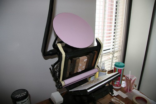
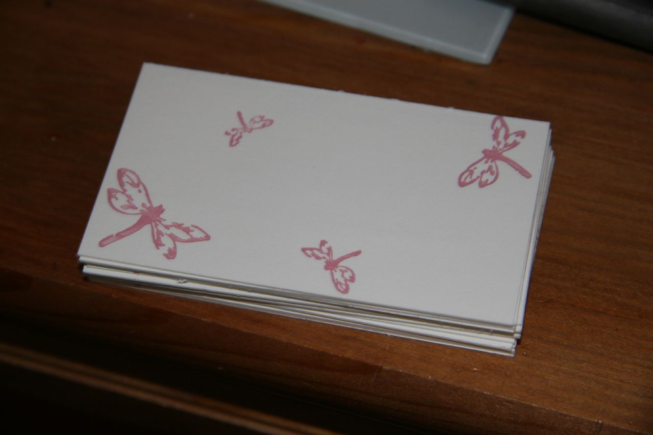
Anyhow, like the Beth Cohen Riding business cards, the Joie Studio design is a 2 color concept, with the four Joie dragonflies in the back in a light pink and the text in front in a deep red color. I also printed this on Crane's 179lb cover in pearl white.
Step 1: Pink

This design is a lot easier than Beth's since the second color will lay on top of the first color -- no need for exact registration as in Beth's design.
Here are the dragonflies:

Step 2: Red
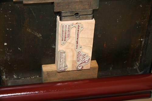
After the pink had dried, I mixed PMS 201 (I had originally mixed PMS 199, but I decided it was too "Corvette" red, and I wanted a deeper, more burgundy tone) and started on the second color. Here is my plate, inked up with red:

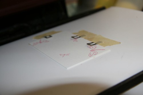
Here is a card with the first color on, on the press for the second color:

FINAL PRODUCT
Here is the final product! Now, to get started on setting up the email address before anyone tries to email Joie Studio!
Anyhow, like the Beth Cohen Riding business cards, the Joie Studio design is a 2 color concept, with the four Joie dragonflies in the back in a light pink and the text in front in a deep red color. I also printed this on Crane's 179lb cover in pearl white.
Step 1: Pink
This design is a lot easier than Beth's since the second color will lay on top of the first color -- no need for exact registration as in Beth's design.
Here are the dragonflies:
Step 2: Red
After the pink had dried, I mixed PMS 201 (I had originally mixed PMS 199, but I decided it was too "Corvette" red, and I wanted a deeper, more burgundy tone) and started on the second color. Here is my plate, inked up with red:
Here is a card with the first color on, on the press for the second color:
FINAL PRODUCT
Here is the final product! Now, to get started on setting up the email address before anyone tries to email Joie Studio!
Beth Cohen Riding Business Card
I just finished a set of business cards for my good friend and longtime client, Beth Cohen. I designed her website for her, and she wanted business cards to match. Here is the design and layout of the business card I designed for her:

To do this, I had two plates made, one for the blue (PMS 306) and one for the brown (PMS 4705). I decided on Crane's 179lb cover in pearl white for the business cards. I custom mixed the colors and set out to print.
Step 1: Blue
Generally you want to print from light to dark, so I started out with the blue. The hardest part is getting the alignment right and avoiding having the gauge pins smashed by the plate. Here is the first color on the card:
Step 2: Brown
After the first color had dried (with rubber based ink, about 2 days in sunny southern California), I started up the press with brown. Generally, you don't want to print the second color while the first color is still wet (the term for this, I believe, is "wet on wet") because there's a chance that the colors will mix and mess up your whole print job. Especially with this color combination. Again, the hardest part of the brown step was the alignment and setting the gauge pins correctly.
FINAL PRODUCT
And here is the final product!

To do this, I had two plates made, one for the blue (PMS 306) and one for the brown (PMS 4705). I decided on Crane's 179lb cover in pearl white for the business cards. I custom mixed the colors and set out to print.
Step 1: Blue
Generally you want to print from light to dark, so I started out with the blue. The hardest part is getting the alignment right and avoiding having the gauge pins smashed by the plate. Here is the first color on the card:
Step 2: Brown
After the first color had dried (with rubber based ink, about 2 days in sunny southern California), I started up the press with brown. Generally, you don't want to print the second color while the first color is still wet (the term for this, I believe, is "wet on wet") because there's a chance that the colors will mix and mess up your whole print job. Especially with this color combination. Again, the hardest part of the brown step was the alignment and setting the gauge pins correctly.
FINAL PRODUCT
And here is the final product!
Subscribe to:
Posts (Atom)