I'm trying something new this spring to celebrate all things spring!
Introducing our Spring Fling Letterpress Wedding Invitation Special!
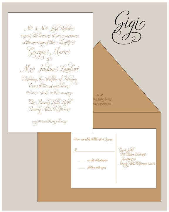
For a limited time only, Joie Studio is offering 100 1-color letterpress invitation sets (your choice of Maybelle, Gigi, Bridgeport, or your own print ready design) for $495 plus shipping and 100 2-color letterpress invitations (Antoinette, Gwendolyn, Austin, or your own print ready design) for $685. The sets include A7 invitation, 4bar response card, outer and response envelopes. You can customize the invites with any of the ink colors on our color chart. I've included the design images below.
This is such a deal! I've listed this deal on our Etsy page and in our online store but you can also email us directly for the deal.
Joie Studio will also be offering a discount on all custom wedding invitation orders through the end of April. Mention the Spring Fling Wedding Invitation Special to get your discount!
Showing posts with label Invitations. Show all posts
Friday, March 22, 2013
Tuesday, October 12, 2010
Baptism Letterpress Invitations
I don't often design baptism invitations, much less baptism letterpress invitations. But my dear friend Bethany and I had talked about baptism invites for her Annabelle. And I think we spoke briefly about her baptizing both Annabelle and Sammy after Sammy was born. And then she had Stella. And then she decided to baptize all three at the same time. A triple baptism! I designed this invitation specifically for the Thies family:
I had it in my head that there should be three doves for each of her children:
A closeup of their names:
I will admit that it took me awhile to get the right yellow for this letterpress baptism invitation, but I think it came out exactly as how I envisioned it in my head.
Congratulations to Bethany and Bob on their beautiful family and the baptism of their children!
I had it in my head that there should be three doves for each of her children:
A closeup of their names:
I will admit that it took me awhile to get the right yellow for this letterpress baptism invitation, but I think it came out exactly as how I envisioned it in my head.
Congratulations to Bethany and Bob on their beautiful family and the baptism of their children!
Wednesday, June 16, 2010
Erin's Bridal Shower...Affordable Letterpress
You know, Erin's letterpress bridal shower invitations are proof that you don't have to break the bank to have gorgeous letterpress invitations. Erin's mother hosted a large bridal shower for her and her sister commissioned us to letterpress 75 invitations and reply postcards for the shower. I looked online at a popular invitation website whose name implies that their printed materials are exceedingly small (but they're not), and the pricing was only nominally cheaper. The tradeoff to get letterpress at such a great price is that you are only doing one color as opposed to the digital prints multiple colors. But I personally believe (of course I would) that the paper Joie Studio offers is better and the letterpress invitation just feels more expensive than digital prints.
These beauties were printed with eco-savvy vegetable oil ink on Stardream Chiara Coral (I believe). To save money, Erin's sister and I decided on letterpress printing in one color and bringing in another dimension of color with the paper. We had wanted to print them on Paper Source's luxe blush, but luxe blush has sadly been discontinued (I pleaded with Waste Not to bring it back, but *blah blah blah* "no one ordered it" - which I don't believe at all), and I remembered that Stardream had a very similar color, albeit shiny. I think this would have been gorgeous enough for an actual wedding invitation. Check it out:
I'm not a huge fan of opting towards letterpress reply postcards, but only because you don't save very much in printing them (or at all sometimes) and the postal service is not gentle on letterpress. By using postcards, though, the shower hosts saved about $12 in postage, which honestly is a decent amount. AND postcards are more eco-friendly in that they don't use envelopes.
Congratulations, Erin, on your upcoming nuptials! Be on the lookout here (they will be posted after the wedding) for her fantastic letterpress wedding invitations.
These beauties were printed with eco-savvy vegetable oil ink on Stardream Chiara Coral (I believe). To save money, Erin's sister and I decided on letterpress printing in one color and bringing in another dimension of color with the paper. We had wanted to print them on Paper Source's luxe blush, but luxe blush has sadly been discontinued (I pleaded with Waste Not to bring it back, but *blah blah blah* "no one ordered it" - which I don't believe at all), and I remembered that Stardream had a very similar color, albeit shiny. I think this would have been gorgeous enough for an actual wedding invitation. Check it out:
I'm not a huge fan of opting towards letterpress reply postcards, but only because you don't save very much in printing them (or at all sometimes) and the postal service is not gentle on letterpress. By using postcards, though, the shower hosts saved about $12 in postage, which honestly is a decent amount. AND postcards are more eco-friendly in that they don't use envelopes.
Congratulations, Erin, on your upcoming nuptials! Be on the lookout here (they will be posted after the wedding) for her fantastic letterpress wedding invitations.
Thursday, July 31, 2008
Anatomy of a Custom Letterpress Baby Shower Invitation
Here is Joie Studio's first anatomy lesson, where I'll take you through the making of a custom letterpress baby shower invitation from start to finish. Here at Joie Studio, we meld old and new letterpress techniques to get our desired results, and this baby shower invitation, more than many other projects here at the studio, showcases the different techniques we use, making it a great project to use for our anatomy lesson.
Concept
This project is actually for a very dear friend of mine, so Rebecca, the host of the baby shower, gave me a free rein to do whatever I wanted. I knew that the couple were decorating the nursery with a hippo theme, and as there is a hippo in Joie Studio's upcoming baby line, I decided that it would be the perfect design.
The hippo is part of a safari group that was created and illustrated by the ever talented artist Matt Cox. I laid out the shower invite digitally to figure out how the layout and spacing. Here is the digital proof:

The fonts in the proof are Kabel and Liberty. Kabel is the digital version of Sans Serif Light, and Liberty is a variation of Bernhard Cursive. Both these fonts are fonts that I have handset type for.
Setting the Forme
Here at Joie Studio, we use a combination of handset type and magnesium plates to letterpress our projects.
Here is what a case of type looks like:

To set it, you would take each letter out, one by one, and set it on a line. Time consuming, but I think that handset type gives the best result so I keep as many fonts as I can fit into my type cabinet. The case above is pretty empty, but some of the other drawers weigh as much as 50 lbs.
As space is a major consideration and setting type is majorly time consuming, we also use metal plates. The metal plates are etched from digital files that we send to the engraver's. We used to have our metal plates mounted on wood and we still use a lot of our plates that we had made that way:

I found, however, that I wasn't happy with the natural variations of the wood mount. As it's an organic material, wood will expand and contract depending on weather conditions, and with letterpress, even 1/1000 of a difference will translate onto paper. Sometimes it's ok, sometimes it's not. So now we order unmounted metal plates with a deeper etch that we mount onto a metal base. The deeper etch also allows us to give a deeper impression to our clients who want to go as deep as possible. Here's a closeup of an unmounted metal plate:

For this project, we used a combination of handset type for the text and a metal plate for the hippo illustration. Once the type is set, I use wood pieces called furniture to lock the set type into the chase (which is the frame that fits into the press). What is to be printed, once set, is called the forme, shown below:

Most ink colors are handcrafted by yours truly. Sage is a color that I use a lot so whenever I mix sage, I try to make a bunch extra. For letterpress, you don't use very much ink at all during a run. I store handcrafted inks in little 2oz tins, and as you can tell, I rarely mix that much ink, and this amount will last me through at least 2 more jobs:

Just a couple dabs gets the press to look like:

So after I letterpress printed the forme, the invitations looked like this:

It's still missing the hippo. The hippo is on an unmounted metal plate. To print the plate, it is first locked into a metal base, also known as a honeycomb or patent base:

The forme is then set into the press to be printed:

Notice the roller bearers on both sides? The bearers keep the rollers inking the forme properly, which is essential for gorgeous letterpress printing.
The Result
Here is the result of all that hard work:

I hope you love the result as much as I did, and I hope you enjoyed a peak at our letterpress process from concept to creation. The LUXE letterpress launch has taken up so much of my time that now that it's launched, I can turn my attention to debuting these gorgeous letterpress animals. Keep on the lookout for more animals in Joie Studio's upcoming baby line!
Concept
This project is actually for a very dear friend of mine, so Rebecca, the host of the baby shower, gave me a free rein to do whatever I wanted. I knew that the couple were decorating the nursery with a hippo theme, and as there is a hippo in Joie Studio's upcoming baby line, I decided that it would be the perfect design.
The hippo is part of a safari group that was created and illustrated by the ever talented artist Matt Cox. I laid out the shower invite digitally to figure out how the layout and spacing. Here is the digital proof:

The fonts in the proof are Kabel and Liberty. Kabel is the digital version of Sans Serif Light, and Liberty is a variation of Bernhard Cursive. Both these fonts are fonts that I have handset type for.
Setting the Forme
Here at Joie Studio, we use a combination of handset type and magnesium plates to letterpress our projects.
Here is what a case of type looks like:

To set it, you would take each letter out, one by one, and set it on a line. Time consuming, but I think that handset type gives the best result so I keep as many fonts as I can fit into my type cabinet. The case above is pretty empty, but some of the other drawers weigh as much as 50 lbs.
As space is a major consideration and setting type is majorly time consuming, we also use metal plates. The metal plates are etched from digital files that we send to the engraver's. We used to have our metal plates mounted on wood and we still use a lot of our plates that we had made that way:

I found, however, that I wasn't happy with the natural variations of the wood mount. As it's an organic material, wood will expand and contract depending on weather conditions, and with letterpress, even 1/1000 of a difference will translate onto paper. Sometimes it's ok, sometimes it's not. So now we order unmounted metal plates with a deeper etch that we mount onto a metal base. The deeper etch also allows us to give a deeper impression to our clients who want to go as deep as possible. Here's a closeup of an unmounted metal plate:

For this project, we used a combination of handset type for the text and a metal plate for the hippo illustration. Once the type is set, I use wood pieces called furniture to lock the set type into the chase (which is the frame that fits into the press). What is to be printed, once set, is called the forme, shown below:

Most ink colors are handcrafted by yours truly. Sage is a color that I use a lot so whenever I mix sage, I try to make a bunch extra. For letterpress, you don't use very much ink at all during a run. I store handcrafted inks in little 2oz tins, and as you can tell, I rarely mix that much ink, and this amount will last me through at least 2 more jobs:

Just a couple dabs gets the press to look like:

So after I letterpress printed the forme, the invitations looked like this:

It's still missing the hippo. The hippo is on an unmounted metal plate. To print the plate, it is first locked into a metal base, also known as a honeycomb or patent base:

The forme is then set into the press to be printed:

Notice the roller bearers on both sides? The bearers keep the rollers inking the forme properly, which is essential for gorgeous letterpress printing.
The Result
Here is the result of all that hard work:

I hope you love the result as much as I did, and I hope you enjoyed a peak at our letterpress process from concept to creation. The LUXE letterpress launch has taken up so much of my time that now that it's launched, I can turn my attention to debuting these gorgeous letterpress animals. Keep on the lookout for more animals in Joie Studio's upcoming baby line!
Friday, April 11, 2008
Circles & Dots Custom Baby Shower Invitations
On Monday, I showed you circles & dots baby shower invitations after the first run of blue. I was asked for fun custom letterpress shower invitations that weren't too "baby." Here is the result, which I absolutely love:
Congratulations, Brad & Megan!
Monday, October 8, 2007
Baby Shower Invites Complete!
I delivered the baby shower invites today! I LOVE LOVE LOVE how the colors turned out. I don't want to show the whole picture because I haven't had a chance to blur out the address and phone number on the invitation, but here is a taste:
Baby Shower Invitations In Progress!
Tonight I finished setting the type for a baby shower invitation. It's a two color design, with a mix of custom plates and hand-set type. I had ordered plates for the gerber daisy motif and some script that I wanted to use for the invitation and printed it in pink:
While I was waiting for the first pink run to dry, I began setting type. Tonight, I worked out the line spacing and locked the form into the chase. I didn't have enough slugs in the right size, so I used smaller sizes. Not the most ideal, but it gets the job done. The type is pretty secure in there, so I think it'll be OK:
I pulled a test print with no ink, just impression, and it came out great:
Tomorrow in daylight, I'm going to finish up these invitations, printing the text in a lovely green color. Here's hoping it turns out well!
While I was waiting for the first pink run to dry, I began setting type. Tonight, I worked out the line spacing and locked the form into the chase. I didn't have enough slugs in the right size, so I used smaller sizes. Not the most ideal, but it gets the job done. The type is pretty secure in there, so I think it'll be OK:
I pulled a test print with no ink, just impression, and it came out great:
Tomorrow in daylight, I'm going to finish up these invitations, printing the text in a lovely green color. Here's hoping it turns out well!
Subscribe to:
Posts (Atom)