Friday, August 17, 2007

More Pics of Katie-Brandon Invitation Suite -- Part 2: Enclosure Cards

Here are the menu and reply cards. I especially love the sage green wording to complement the chocolate brown!

Posted by Picasa

More Pics of Katie-Brandon Invitation Suite -- Part 1: The Whole Invitation

For some inexplicable reason, Picasa will only let me post four pictures at a time. So be it!

Here are pictures that I took from the invitation that was sent to us by the bride and groom. The bride added a second pink ribbon to the design. Here it is, straight out of the envelope!

Posted by Picasa

Thursday, August 9, 2007

New Website in 3...2...

I'm almost done with the new website for Joie Studio! In about a week (maybe less!), I will be launching Joie Studio's official business website at http://www.joiestudio.com. If that's how you've been getting here to this blog, don't worry, the blog isn't going anywhere, and there will still be a link to this blog from the new website.

Wednesday, August 8, 2007

Katie-Brandon Invitations Done!

Whew! So I got the plates from Owosso Friday, I letterpressed this set of wedding invitations on Saturday, Sunday, and Tuesday, and the bride and groom picked them up Tuesday night! Needless to say, they are as happy as can be with these invitations. I'm glad, because it was a lot of hard work to get this job done by the deadline. Two of the plates I ordered were bad, but I called Owosso Monday morning and they had plates to me the very next morning to complete the job.

The job went really fast compared to the last set of invitations, and now I can take a break. Which is good, because we're off to Hawaii today for a wedding this weekend!

The invitation is printed in chocolate brown ink with sage green ink for accent lettering and decorative elements on Crane's Lettra in Pearl White. It is mounted onto a 5.5" square enclosure card in sage green. On the front, there is a mauvy pink ribbon sash and a letterpressed name plate on a chocolate brown border. I haven't had time to take pictures of each individual letterpressed card, but here are some of the shots of the fully assembled invitation suite:


You can compare the final product above to the original design I posted awhile ago:


Pretty close results!

Tuesday, August 7, 2007

Question on Ink Colors

I just saw this question on my blog post about inks:

Jen said...
Are the Rubine Red, Pantone Yellow, Process Blue, and Opaque White the only colors you use to mix with? I also have a PMS Guide and want to avoid spending $100 ordering 1lb cans of ink in all the colors so I'm trying to figure out which basic colors I can get by using to mix the PMS colors.


First, there's a great discussion on ink on Briarpress that you can look at that gives you tips on ink. I found it particularly helpful. You can order some lithographic ink to save some money, which tends to come in smaller cans and therefore cheaper. However, since it's oil based, it will dry in can, which, along with ease of cleaning, was a huge concern for me when I was deciding what to do in the beginning.

As you know from the post about ink, I started off with Rubine Red, Pantone Yellow, Process Blue, and Opaque White rubber based ink. I got black as samples from a bunch of places, and I also purchased metallic gold (from Accent) and silver (from Van Son) oil based ink because I have a thing for metallics. I chose these particular colors after thinking about what colors I would initially be using and going through the PMS color guide and seeing which red, yellow, and blue matched my needs best. I still use these colors extensively, but I've found that I have needed other colors as well.

Luckily, I have a friend who is also starting her own letterpress studio and her initial needs were Red Pepper (PMS 199), Pantone Yellow, Pantone Green, and Reflex Blue. She also decided to get a mixed Chocolate Brown (a must in this design time). Then we met and traded inks. I figured out later that I really didn't need Red Pepper from her since it's based on Rubine Red, but I've used that as a basis for Joie Studio's pink (added white) and red (added black) business card colors since it's easier than starting from scratch. I also mixed the Pantone Green with the metallic silver for the blue-green coasters I did recently. I also just stole a little bit of Warm Red and Pantone Purple from her.

Next on my list to acquire will probably be Warm Red and PMS 8560, but I'm waiting for that design project to start before buying.

My advice to you is to look through the book and decide what colors you absolutely need, then buy more colors as you go along to spread out the cost of ink. At the end of the day, $20-$25 every now and then isn't so bad. My initial purchase of those 4 pantone colors plus the metallics probably set me back well over $100, so it's not cheap, but I figure that the rubber-based inks will last me for a long time, as opposed to the 1/4lb cans of oil based inks that may dry up on me before I get to use a significant amount. In letterpress, a little ink goes a long way.

Monday, August 6, 2007

Chocolate Brown Run


The Chocolate Brown run is done for the night! And I'm done as well! Hopefully I will have the strength (and time!) tomorrow to tell you more and post some pictures.
Posted by Picasa

Me at my press

So usually you won't see pictures like this, because I'm usually the one taking pictures of my work. And since I'm deathly afraid of getting ink all over the camera, it's rare for me to have pictures taken during the process of making the cards. But my husband was home yesterday, and he happened to catch some of the action while I was doing the sage run.


Posted by Picasa

Sunday, August 5, 2007

Another Day, Another Press Run!

So for the second day in a row, I was printing on my letterpress from mid-afternoon into the night. It's around 1AM now and I am just putting my feet up for a moment before cleaning the press off. Whew!

Today I did just one color -- Paper Source's sage on Crane's Lettra for the wedding invitations that I'm working on right now. I've learned a couple lessons on setting the platen that I'll share with you once I get the second color on -- it'll be easier to see what I've devised in the chocolate brown ink I'm doing next.

But let me just say a word or two about Crane's Lettra. Every other letterpress blog has been raving about Lettra, but I was hesitant because, well, how could it be better than handmade paper? This is the first project I've really worked with the Lettra stock, and WOW I'm impressed with the results. The paper is super soft with a very nice texture, and it takes impression so well I'm only sorry I didn't figure this out sooner. And for the price, it's so worth it.

Now, back to the press to clean it off for the night so I can start bright and early in the morning! Pictures of the project soon, I promise!

Saturday, August 4, 2007

Letterpress Coasters - Round 1 of printing

So I haven't been doing much printing lately. Frankly there's been a lot of personal issues. But today was back to the press, and with some great results.

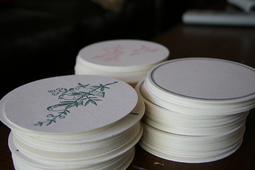
My friend Carrie had gotten a bunch of coasters, and she gave me some to try out. I finally decided to make the coasters a gift for a friend and a vintage-y bird motif as one of Joie's inaugural etsy items.

Today I did three different colors on the press! These are just the first run of each coaster - none are complete, but I thought I would give you a sneak preview:


If you want to see more, I've put the pics up on my flickr page. Enjoy!

Wednesday, August 1, 2007

Questions on Custom Plates for Letterpress

I've had these two questions on my blog recently about custom letterpress dies:

Why did you decide to use plates instead of handsetting the type? I was given some type when I bought my Pilot press but I am thinking of trying out the plates. It definitely seems like the easier way to get more font choices. Plus no dropped trays. (my biggest nightmare/fear)

What kind of die cuts are those? They don't look photopolymer. Do you have good success with them?

To answer these questions, first, let me address handsetting type. I don't generally handset type because, first and foremost, I don't have a lot of room to keep a wide variety of type in different sizes and fonts. Secondly, it costs a lot of money to amass the collection of type that I would want to do the things I do right now. Third, it would take forever to set and reset type on the whim of my clients. Fourth, it's a lot easier to have a custom plate made. Fifth, there are some designs that I use and that I create that are not available, so I need to make custom plates for those. Sixth, setting type is a labor of love, and while I like to do it, I would do it only for personal projects because of the time and effort it takes to handset type.

Platemaking is fairly inexpensive, although in the long run you do pay for the convenience. With type, it's a one time charge per font face and size. But I get exactly the layout and type I want, I can send electronic proofs for clients to look at and revise before I get started, and once it's done, I have the option of giving the plates to my clients for safekeeping in case I run out of room.

I don't use photopolymer plates. When I first looked into them, I didn't quite understand them (still don't, really, although I hear they are easy) and the base and photopolymer plates seemed more expensive than what I was already using. Although photopolymer plates are easier to store and you can cut them up and reset them in any number of combinations, I have heard that the impressions aren't as good as with metal plates and they degrade much faster than their metal counterparts.

I use 16 gauge magnesium plates mounted type-high on wood from Owosso Graphic Arts (see their link in the sidebar on the right). They have a same day turnaround, and through Priority Mail, I usually get the plates 3 or 4 days after I send them the digital file. I've been very happy with Owosso's service and pricing, and, as the saying goes, if it ain't broke, don't fix it!
Related Posts with Thumbnails